How To Build A Responsive Website From Scratch: A Step-by-step Guide
Responsive design is to use phones, tablets, and desktops. A responsive site work smoothly on all devices, making it enjoyable for user. It also help search engine rankings. It is part of mobile-first indexing. This means search engines, like Google, check mobile versions of websites first. Non-responsive sites fall behind in ranking.
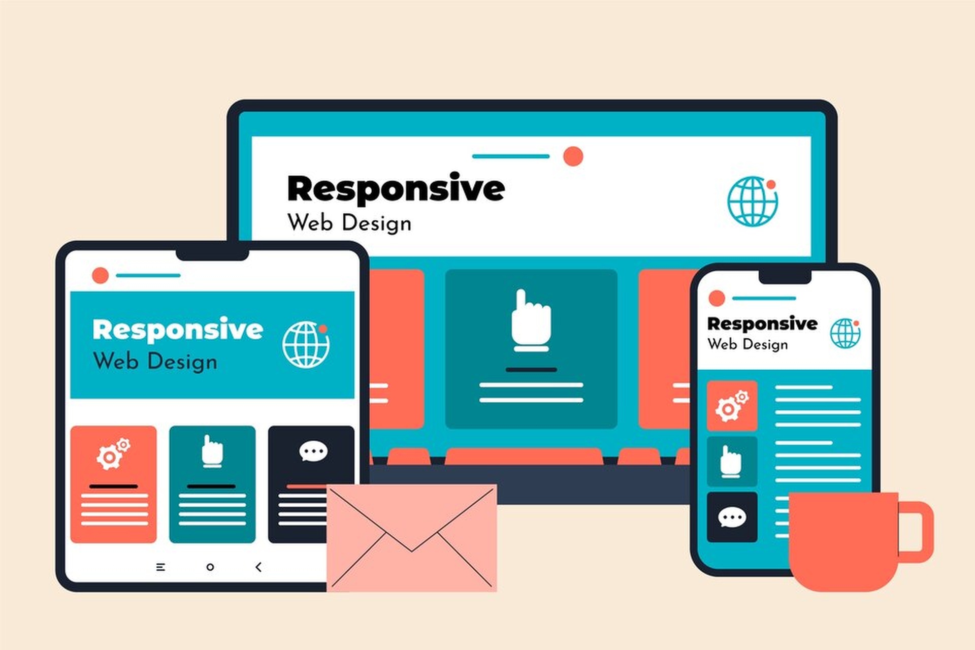
Step 1: Understand Responsive Design
Responsive design help websites fit many screen sizes. The content adjusts automatically. This is useful for phones, tablets, and large-screen monitor.
Responsive design has simple principles. These include flexible layouts, media queries, and using fluid grids. A flexible layout resizes content smoothly. Media queries help with screen-specific rules. Fluid grids use fractions instead of fixed measurements. Try knowing some responsive tools like Bootstrap.
You need to know basic coding. HTML, CSS, and JavaScript are your tools. Modern browsers have developer tools for simple testing. Start simple as you learn these skills.
Step 2: Planning Your Website
Planning is the first stage. Set clear goals for your project. Think about what your website does. Is it for information or online sales? Decide who your audience is. Choose the main features.
Sketch a design before coding. Wireframes are like blueprints. They show where to put headers, menus, and content. You can draw wireframes with a pencil or use free online tools.
Pick a mobile-first approach. This means you design for smaller screens first. Then expand the design for larger screens. This saves effort and improves usability for mobile users. Bootstrap or Tailwind CSS can help. These libraries have built-in classes for quick design work.
Step 3: Setting Up The Project Environment
First, you need the right software. Download a text editor. Free options include Visual Studio Code and Sublime Text. Use modern web browsers like Chrome or Firefox. These have tools to preview changes.
Learn version control basics. Git helps store and track changes in your code. Use GitHub, which is a hosting platform for sharing code.
Keep your files organised. Divide them into folders. One for HTML files. Another for CSS files. And another for JavaScript Code. Naming files clearly helps you find things faster.
Learn the HTML boilerplate. It has basic tags like doctype, head, and body. Also, link your style sheets properly. Then add JavaScript at the bottom to have smooth loading.
Step 4: Write The Html Structure
HTML is the heart of your site. Use semantic tags to give the website structure. For example, use a header for the top part and a footer for the end. The main tag is for the content of your page.
Add a navigation bar. This lets users move across your site. Use unordered lists for menu links. Keep it simple so it fits on small screens.
Insert placeholder images and text. Replace them later with your real content. Do not forget accessibility. Add alt text for images to help screen readers. Use ARIA roles to improve navigation for disabled users.
Step 5: Style With Css
CSS makes your website look good. Begin with a CSS reset file. Browsers have different default styles. A reset file removes these small differences.
Use flexible grids. Avoid fixed-width values. Use percentages for sizes so elements resize better. This improves the responsive design.
Breakpoints adjust a site for different screens. Media queries set rules for these size limits. For example, you can hide a menu for screens smaller than 768 pixels.
Typography is also very important. Set font scaling that works on all devices. Small fonts look bad on big monitors. Large font sizes waste space on smaller screens.
CSS Flexbox and Grid tools are great for layouts. Flexbox is effective for arranging columns and rows. Grid gives more control for complex structures.
Avoid inline styles. They make your code messy. Separate your CSS into proper sections for faster editing later.
Step 6: Add Responsive Interactivity With Javascript
Interactivity makes your site engaging. Minimal JavaScript is enough for small projects. Use it for toggling menus or adding animations. For example, make a hamburger menu that opens with a click.
You can start by adding a basic toggle function. Add an event listener to watch user clicks. Let it switch classes between open and closed states. Libraries like jQuery or Alpine.js can make JavaScript simpler for beginners.
Interactive elements improve user experience. They also help users do tasks faster than before. Available JavaScript plugins make adding functionality easier.
Step 7: Test And Optimise
Testing makes sure your site works perfectly. Open your website on different devices. Try tablets and smartphones. Do this to catch design problems.
Check your site with modern browsers. Chrome, Safari, and Firefox have unique features. Ensure your website works the same on every browser.
Optimise your images. Less loading time makes users happy. Use free tools like TinyPNG. These tools shrink files without lowering quality.
Test loading speeds, too. Use online tools like Google PageSpeed. They show problems and give advice. Learning these ideas will keep your website faster for all users.
Finally, use testing tools for designs. Platforms like BrowserStack show you how your website looks on various screen sizes. This will fix small mistakes quickly.
Conclusion
Building a responsive website is easy when you follow the steps. Start with planning then organize your files. Learn simple responsive techniques like media queries and fluid layouts.
Keep studying the subject. The web changes every year. New trends and tools will improve your skills. Join forums or read guides online.
Practice helps most. Use free resources like MDN Web Docs and freeCodeCamp. Share your websites with friends or clients to know mistakes early. Keep building to get better.


